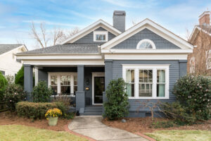
Honoring the Old, Bringing in the New
This kitchen stayed true to the home’s 1930s architecture while giving this family updated functions and a more modern floor plan. The result is a kitchen that mixes old and new. It was very important to our clients that the design stayed true to the style of their 1930s home. At the same time, they wanted us to expand the space and incorporate lots of updated function. Interior designer Ashley McCaul did an amazing job of helping us balance old and new.
We took over a few adjoining rooms in order to provide all of the space the family needed. This allowed us to incorporate a walk-in pantry, a large seating island, more-than-ample custom cabinetry and an easy flow. It is now a sunny and welcoming family kitchen. And while it has fresh new style, it nods to the architecture of the home through well-edited details.
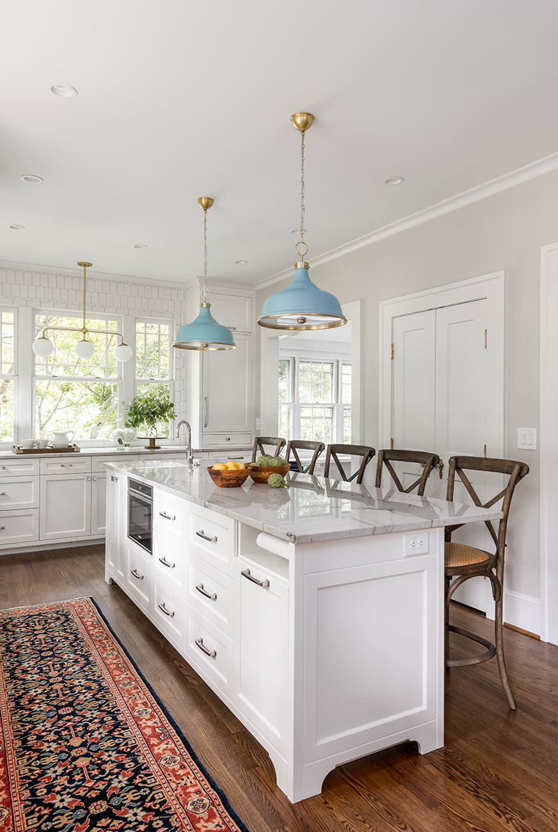
Client Wish List
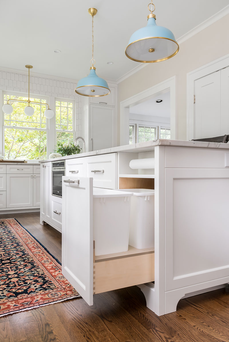
Our clients’ wish list included a large island that incorporated a custom hidden paper towel rod, microwave drawer and trash pull-out. They also wanted custom wood panel fronts for a SubZero fridge, Newport Brass fixtures, oil and spice pull-outs near the range, and custom knobs in turquoise for their BlueStar range. We gave the custom island era-appropriate style with feet that give it a furniture feel and a countertop with marble veining.
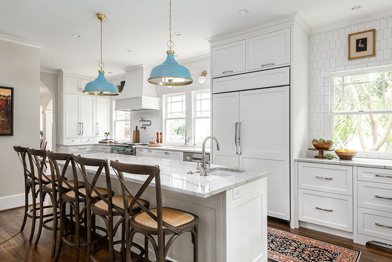
Vintage Style Notes
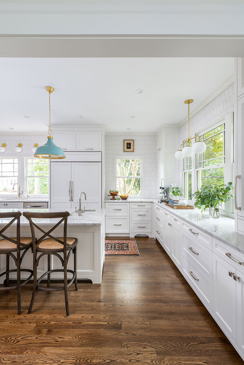
The style of this kitchen was critical. Our clients wanted to honor the 1930s historic architecture while adding some fresh updates. So the kitchen mixes old and new. In order to create a period feel, we matched existing moldings and millwork with the rest of the house, and preserved the existing windows and arched openings. We also continued the hardwood floors into the space. Details like Shaker-style cabinetry, marble-like veining in the countertops, a concealed panel-front fridge, vintage looking pendant lights, white tiled walls and caned counter stools make the space look like it evolved over time.
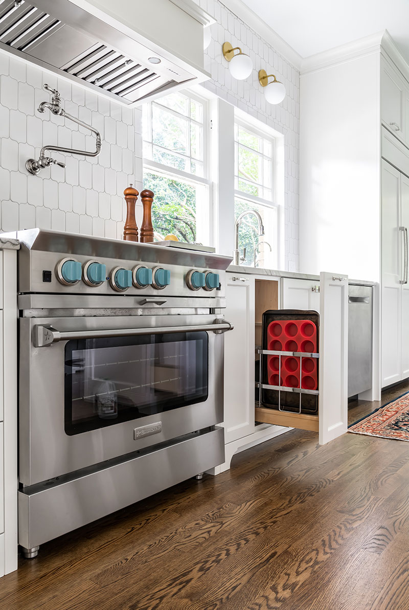
New Style in the Mix
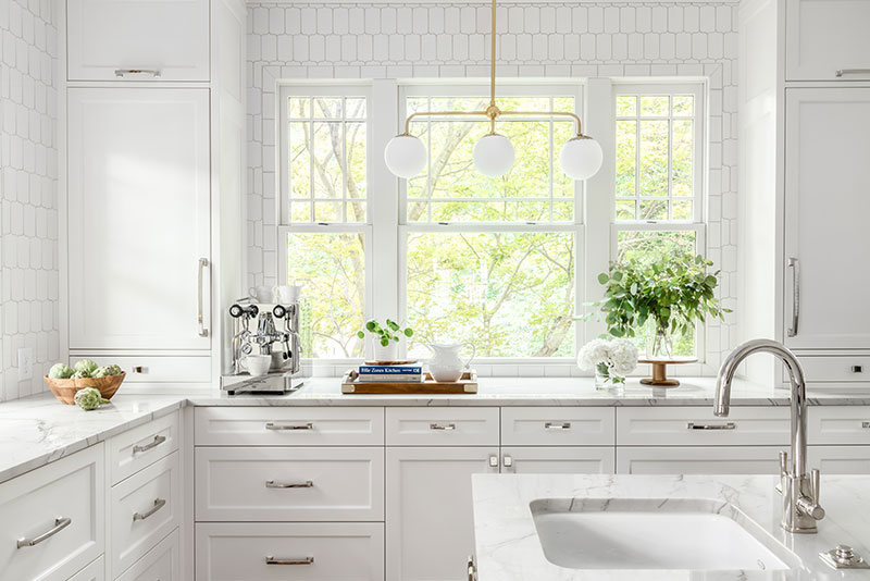
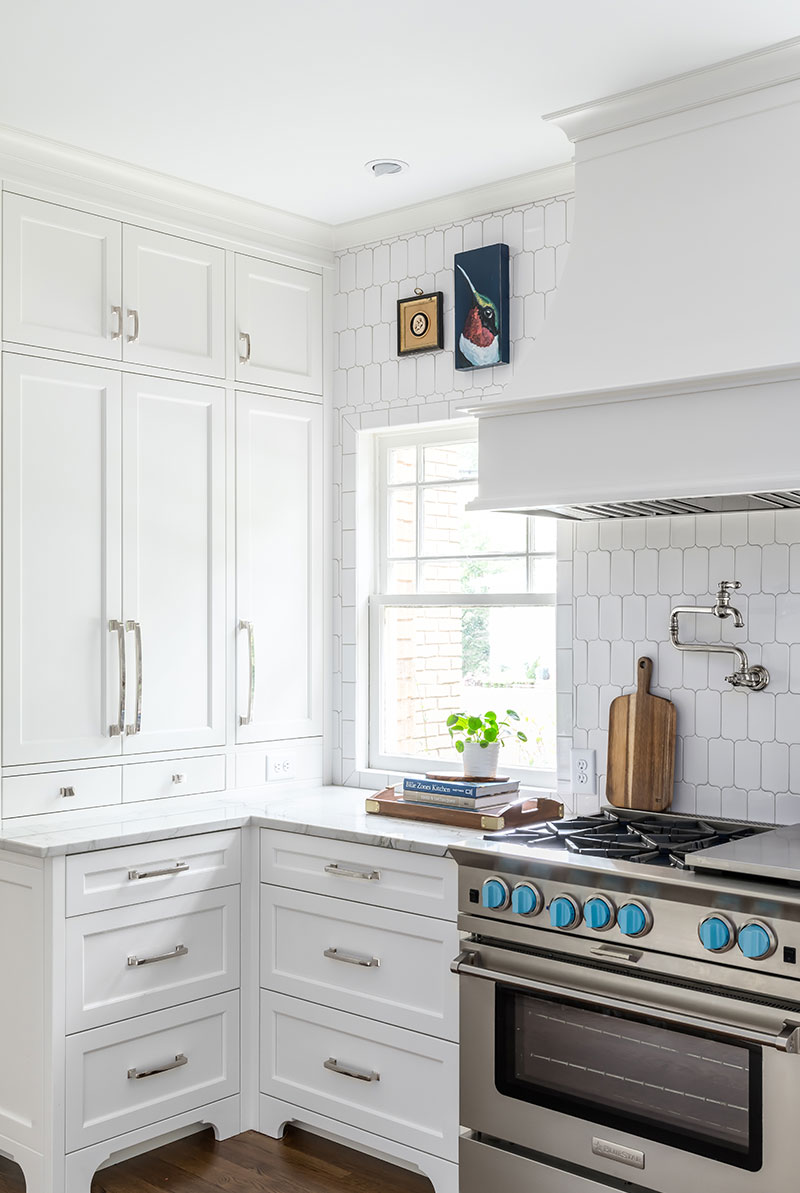
A BlueStar range with turquoise knobs plays off the fun pendant lights. This photo also gives us a good look at the backsplash, which extends all the way to the ceiling. Rather than going with the expected subway or 4-inch square tiles, our clients opted for a white picket tile. This fits in with the architecture in a subtly updated way. The globe light fixtures over the coffee station and sink are another more modern touch.
Function for the Family
The busy family needed ample space to gather as well as functional storage and work space. We created an easy work triangle between the sink, fridge and the range along the exterior wall. The large island provides extra counter space between them, as well as a bar sink, microwave drawer, trash pull-out and additional storage. The seating side of the island is great for keeping the cook company but also staying out of his or her way.
Another great idea was placing a coffee station at the far end of the room. That way someone can use the island sink and get things brewing in the morning while staying out of the cook’s way. Countertop cabinets bookend the expansive window in a pleasing way and provide extra storage.
Updated Function
We outfitted the custom cabinetry with lots of handy inserts like a trash pull-out, a cookie sheet pull-out, a paper towel roll, custom spice racks and much more.
Challenges
While the house was originally built in the 1930s, a hodge-podge of additions had been built over the years. Once demoed, we found one exterior wall needed to be completely reframed to avoid potential structural issues down the road. Although this was an unplanned bump in the road, we were able to reframe it without impacting the project schedule. Another challenge was working with the original windows to maintain the home’s historic charm.
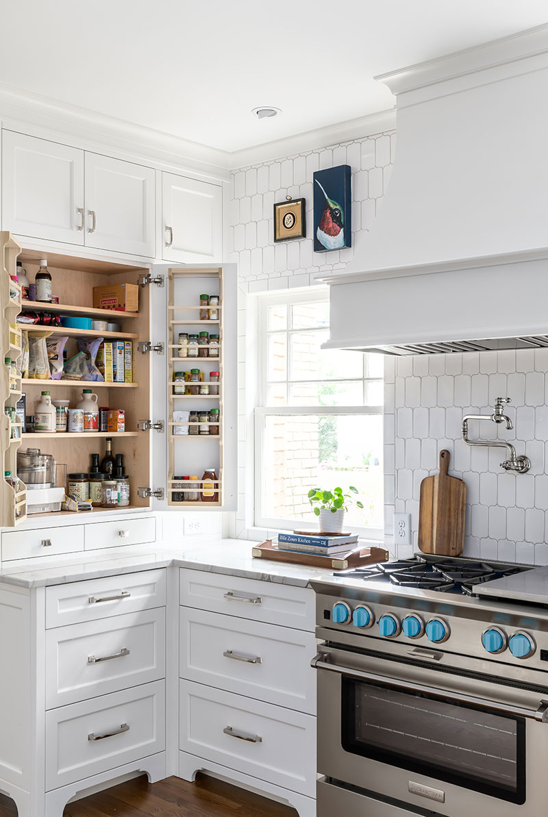
This area shows a spot where the window placement created a challenge. It cut off the opportunity for standard upper cabinets. We solved the problem by creating a shallow countertop baking cabinet complete with a garage for small appliances. It’s a unique element that is a true asset to the look of the kitchen as well as how it functions.
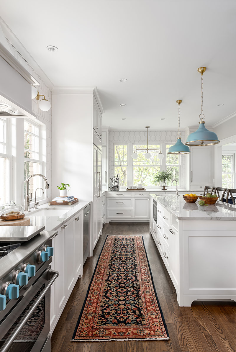
An Oriental runner adds vintage style and warmth to the floor.

