Soft Blues and Warm Neutrals: A Calming and Cohesive Color Story in Milton
Our Milton, Georgia, clients love relaxing shades of blue. For this whole-house remodel, we created a calming atmosphere with a color story: warm creams and tans complement the starring shades of soft blue, with brass accents adding glint and more warmth in the form of light fixtures, plumbing fixtures, frames and hardware.
Being surrounded by calming colors makes home feel like a true retreat, and helps improve overall wellness. We used a consistent color story created a cohesive feel from room to room. Come take a tour through these freshly renovated spaces.
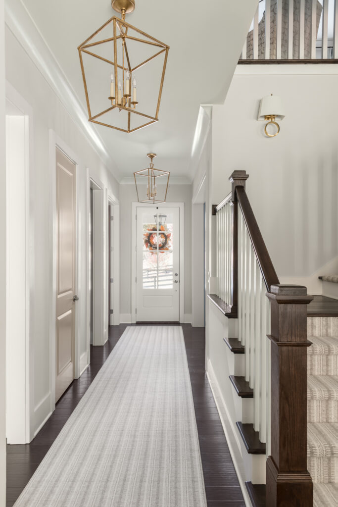
An Inviting Entry
Upon entering the house, light-colored runners and walls create soft contrast to the dark wood floors and stairs and a welcoming vibe. Overhead, brass open lanterns draw the eye up and provide soft light.
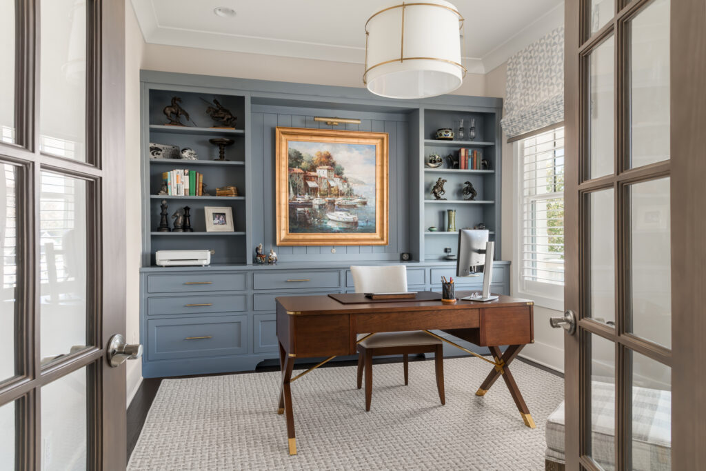
A Library-Like Feel In the Office
Lately we’ve noticed a lot of our clients desire a library feel in their home offices. Here we used soft blue paint (Sherwin-Williams’ Storm Cloud) on the built-ins to provide room for books, display space and hidden storage. The centerpiece is a beloved painting, and we backed its display area with tongue-and-groove paneling and an art light overhead. A textured area rug, bespoke Roman shades and a plaid chair and ottoman bring in soft touches.
Design Tip: Don’t be satisfied with recessed lights alone. This ceiling pendant adds character and texture on the ceiling, and the art light is a fantastic way to keep a soft glow at night — those walking by the office’s French doors can still enjoy the view as they walk by.
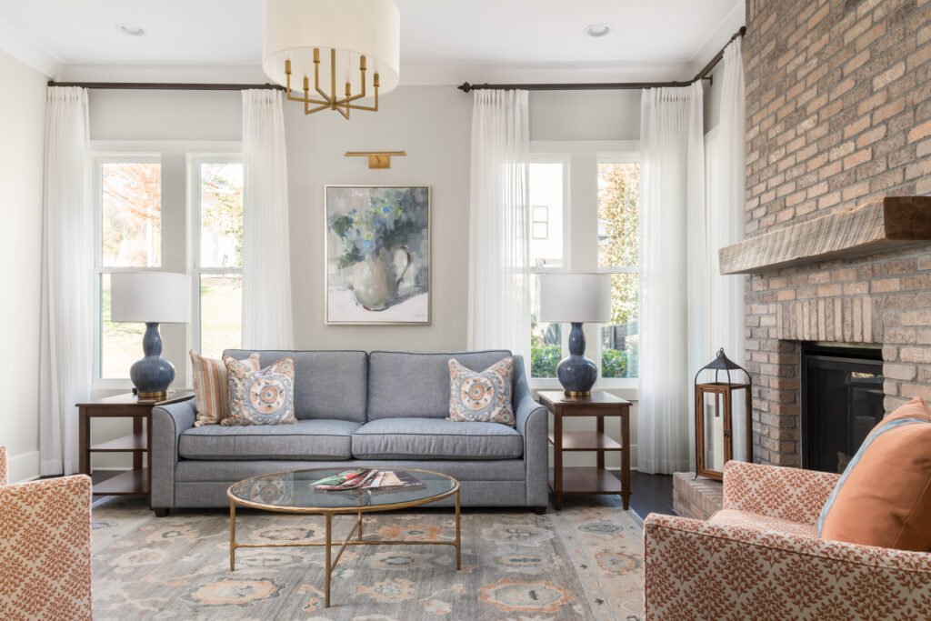
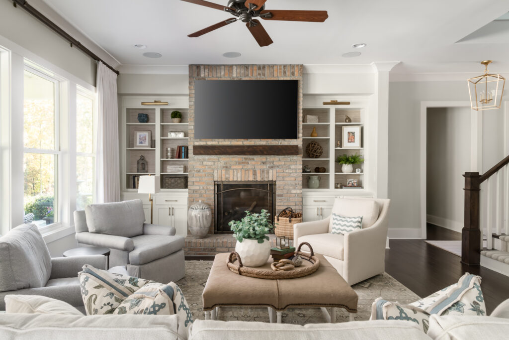
Opposite Colors Join the Color Story
In the living room, our clients liked the idea of playing off the bricks on the fireplace surround. The opposite of blue on the color wheel is orange, and a more sophisticated take on that is using blue-gray with ochres and terracotta. Combining these shades kept the cohesive and calm feel yet ramped things up a bit.
I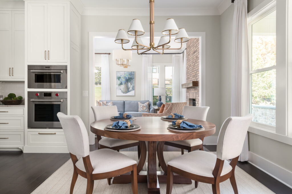
A Dollop of Blue and Lots of Cream in the Kitchen
The living room is open to the eat-in area of the kitchen. In here, the dominant tones are cream, accented by dark wood and a powder blue kitchen island. This breakfast nook area enjoys the light and views from a large bank of windows. A brass chandelier with shades cozies up the space.
Design Tip: The most inviting dining tables are round. They inspire conversation and are preferred in feng shui design.
Cabinet paint color: White Dove, Benjamin Moore
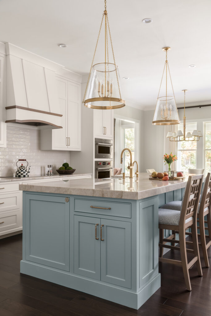
Looking toward the eat-in area across the kitchen island, we see the room’s big dollop of blue (Benjamin Moore’s Jubilee). The cabinetry has traditional Shaker-style with a beaded detail.
Brass details tell another part of the color story — the eye can catch this metal finish on the hardware, the faucets and the light fixtures. Keeping the metals within the brass family also added to the calming and cohesive feel of the room.
Design Tip: Note the way the island’s Taj Mahal quartzite countertop has a thicker edge (2.5 inches) than the perimeter cabinets. This special touch helps the island stand out in the room.
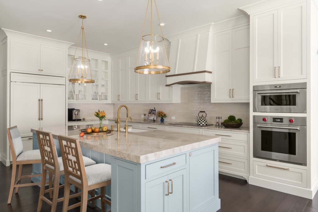
Other special details in the kitchen are the custom range hood with wood accents, the diamond-paned glass cabinet fronts that keep the area next to the fridge feeling airy and the wood counter stools with a Greek key pattern. Curating just the right amount of details adds personalized character without being too busy.
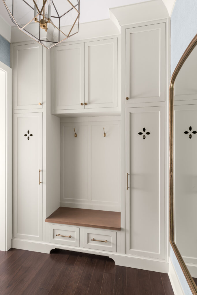
A Place For Everything in the Mudroom
The family stays organized whenever they enter the home, thanks to custom lockers, cabinets and drawers in the mudroom. A bench provides a perch for putting on and taking off shoes, while a large mirror allows one last fit check before exiting the house.
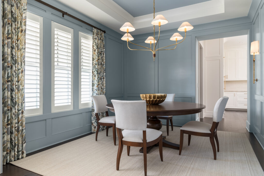
Color Drenching In the Dining Room
In some rooms, blue appears in dollops, while in others it saturates. The dining room is drenched in Benjamin Moore’s Jubilee, the same color used on the kitchen island. One exception is on the soffits, which are White Dove. Whatever the balance, these tones together are calming and cohesive. Again, wood and brass layer in more textures, and in here, the drapes add softness and a botanical pattern.
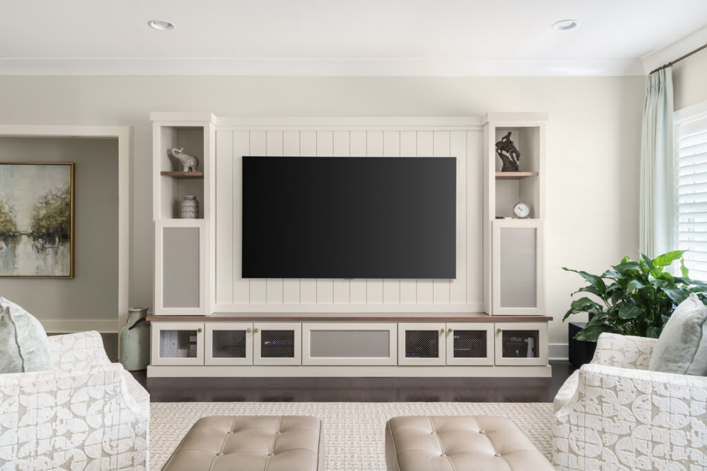
Hidden Speakers in the Media Room
In the TV den, the screen dominates, as it should! However, our clients didn’t want media components to take over. Built-ins, including special speaker cabinets with mesh doors that flank the TV, continue to lend the calming and cohesive feel in this room. A monochromatic color scheme is punctuated by the colors in the landscape painting, and materials like the wool rug, tufted leather ottomans and patterned swivel chairs create layers of texture.
Design Tip: Concealing media equipment will help you achieve a calming and cohesive atmosphere.
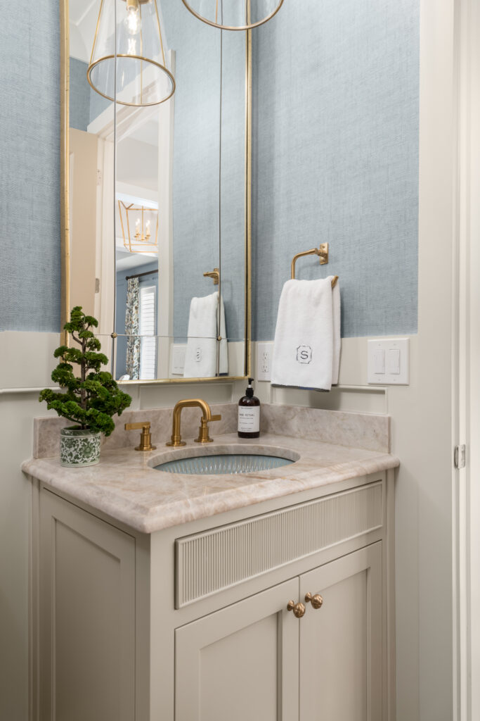
Hitting the Right Amount of Detail in the Powder Room
Balancing in the right amount of thoughtful custom details in the bathroom adds character while maintaining a calming and cohesive fee. Just a touch of ribbing on the cabinetry, a blue textured sink and a stunning mirror with brass detailing make the room personalized and special. Textured blue wallpaper and wainscoting complete the room.
Conversation in the Family Room
While a family room often revolves around TV watching, this one is also set up for conversation. Versatile swivel chairs can turn to face the fireplace and the game, or toward the other people in the room when the TV is off. The calming and cohesive color palette, marked by a few pops of soft blues and deep tans, fits right in with the rest of the home.
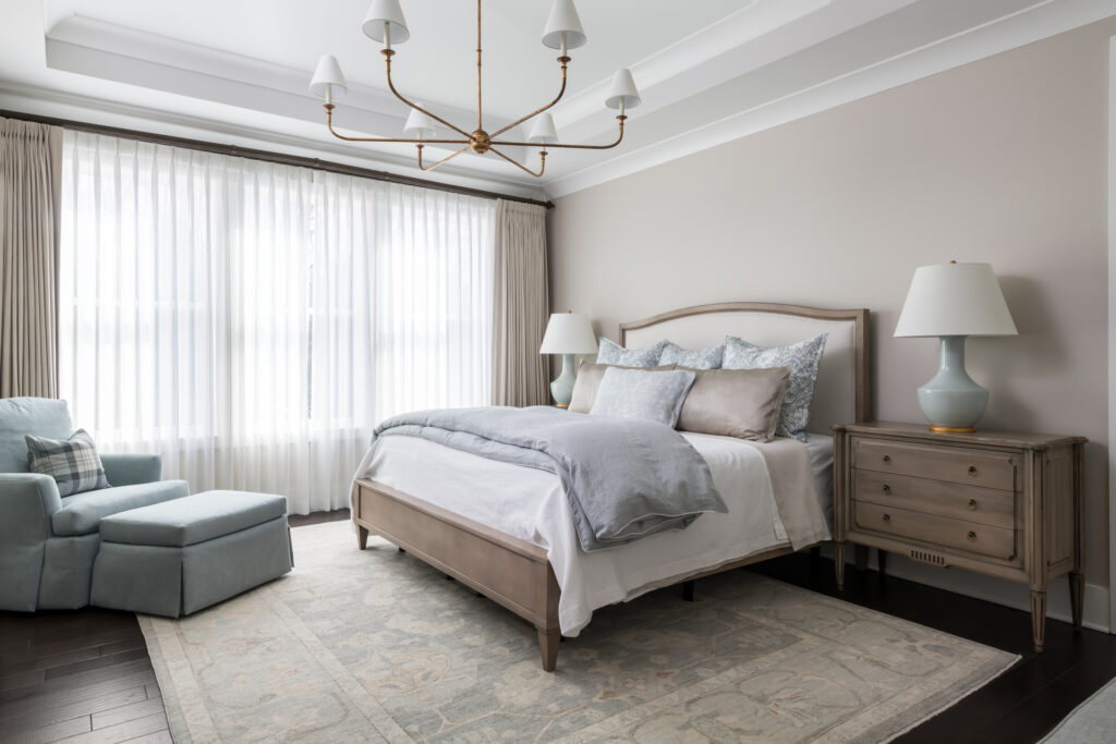
A Restful Bedroom
A focus on rest and relaxation continues in the primary suite, where natural wood, an upholstered headboard, a soft rug and a comfy armchair with an ottoman set the scene. Sheers on the windows can filter the natural light during the brightest hours, while lined drapes will maintain total darkness for sleeping in. The brass chandelier fits the scale of the tray ceiling, while the soft palette makes feeling calm and rested easy.
We hope you enjoyed touring this calming and cohesive whole-house remodel in Milton, GA. If you’re ready to start the process of improving your metro Atlanta-area home in any way, please contact us for a consultation.
Quick Notes on How To Create a Calming and Cohesive Feel
- Choose a general color palette, then play off it throughout the house. In this case, our clients wanted to emphasize blue and we used soft neutrals to complement it.
- Cabinets and other built-ins are a good place to add color, complemented by neutral walls.
- Depending on the mood you want to evoke, amp up the color in some rooms and tone it down in others.
- To create pleasing contrast, check opposite colors on the color wheel, then scoot over the adjacent colors.
- While some mixing of metals is fine, try to have one main metal finish that is prominent throughout the house. This includes doorknobs, cabinet hardware, lighting and plumbing fixtures.
- Layer textures to add interest
- Always step back to check for balance. This can mean subtracting something that makes a room too busy
- Take advantage of natural light, and use windows as an opportunity to add color and texture via treatments
- Rugs and throw pillows are a great way to bring in color and pattern.
If you enjoyed this story, here are a few more links we think you’ll enjoy:
5 Ways To Make Your Bathroom Feel Like a Wellness Spa
5 Ideas to Perfect Your Chef’s Kitchen
Elegant Primary Bathroom Renovation